
Intel Joins Three Billion Other Oval-Logoed Brands
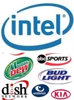
Thanks to Hurt Elbow, we now have visual proof the new Intel logo leaps ahead of nothing and simply joins the "logo ovalation" crowd. Check out all the unoriginal, copy-cat insanity here in one gigantic, orgasmic ovalistic circular logo-fest that either proves originality is dead or that all these brands used the same focus group.


Comments
of the oval logos, i am most annoyed by the "swoosh" logo subset. counting non-oval swooshes, i think there are actually more swooshes than ovals out there. both must be stamped out. and no, i'm not e.e. cummings; i just forgot to push the shift button.
Intel's new logo is still relatively better than Kodak's new logo.
Om Malik has some good points about the recent logo changes
Gigaom logo post
Don't even get me started on this.
(2008 is going to be the year of the square. I can feel it!!!)
To be fair, it already had an oval on it's intel inside campaign..
originality does have one hand on the ground and the other reaching out to it's killer, begging it not to take one last long speared death blow to its heart. on the other hand thought, all these brands are successfull. ah...whatever...
originality does have one hand on the ground and the other reaching out to it's killer, begging it not to take one last long speared death blow to its heart. on the other hand though, all these brands are successfull. ah...whatever...
maybe these companies think they are being "cutting edge" and "hip" by "ovalizing" their logos cause you know..squares are just so archaic.
Post a comment