
Pepsi Unveils Packaging to 'Digital and Social Media Influencers'
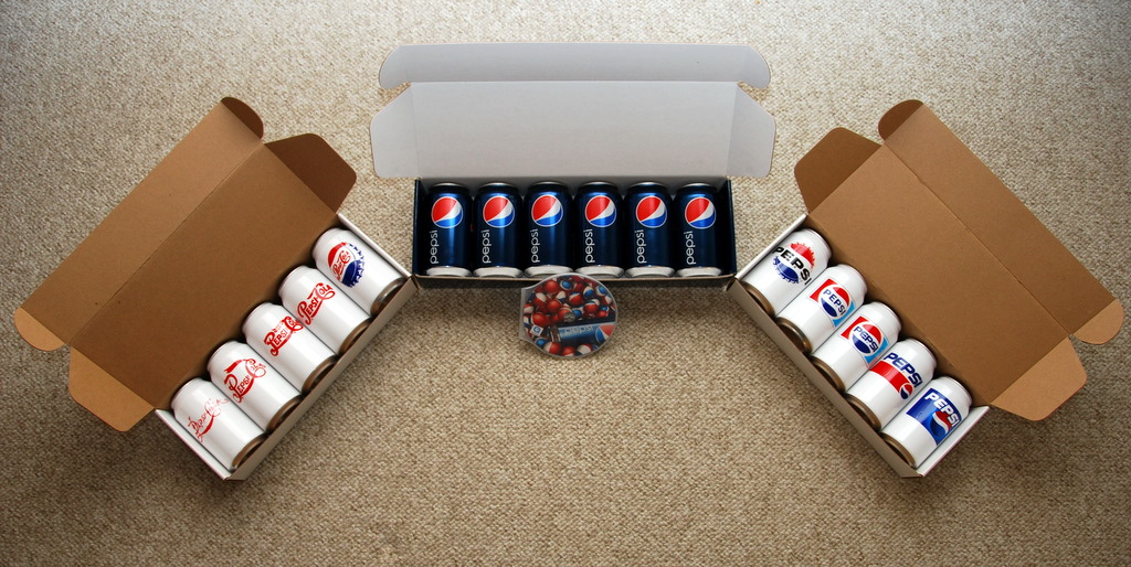
Today, Pepsi, with strategic help from Edelman, reached out to 25 "digital and social media influencers" with three separately-shipped packages. The first contained five cans representing logo design from 1898 to 1950. The second contained five cans representing logo design from 1962 to 1998. The third contained (yes, you guessed it) the newly launched can design - six of them full of actual Pepsi.
Accompanying the final shipment was a DVD highlights of the company's 110 year history including the debut of the new logo and packaging across all product lines. You can watch the video here.
When the logo was unveiled last week, it received somewhat of a lukewarm reception. Seeing the final product though may sway some naysayers. The logo and product design are sleek, simple and refined. It's a welcome change from the rather boxy typeface used since 1962.
As part of the launch, Pepsi is making use of Friendfeed with a room called Pepsi Cooler. Supposedly, it's where all the social media geeks can go and comment ad nauseum on the logo, product design and whether or not any of this has anything to do with the fact the product itself is nothing more than sigar water with a little caffeine tossed in.
Comments
I'm not a fan of the new logo. It looks like pale midriff. But I'm no expert.
This is a "welcome change??" I agree they might need a facelift, but this is just awkwardly terrible.
i think it's a good idea to punt the new brand out to bloggers and opinion influencers, but it seems backwards to do it after the brand has been completed. Surely getting opinion from these people during the development phase would have been more informative.
There are nice elements in the new brand work, but dragging up some of their design crimes from the past and putting it next to the new work is really not going to place it amongst illustrious company.
Perhaps creating an online platform which invited the digital world to feed back and suggest how to progress would have put them ahead of the curve. Make the brand process truelly interactive and you immediately empower the consumers.
I respect Pepsi for taking on the world's biggest brand, but i fear they will continue to play catch up with tactics like these.
As a 40 year graphic design professional and a life-long Pepsi drinker, I now will have to drink it with my eyes shut. Hopefully the taste will continue to inspire me to purchase. The logo and can have lost the fizz!
The bottle looks like a boy's thingy, and the new logo looks like the girl's thingy that it's supposed to go into. I don't understand it.
The "pepsi" font I like. They're clearly taking us towards the way we know the brand to be in 2015, as seen in Back to the Future II.
Who can I get in contact with to try and get this promotional? I'm a product designer and Pepsi fan from Mexico and I would LOVE to have this.
Thanks
~luis
So, what is the definition of brand management? What was the compelling problem this design is supposed to answer? The original logo wasn't the problem. So, any change to it will not necessarily make a difference. What market(s) Pepsi chooses to pursue, and how, are bigger strategic challenges that (one can argue) are independent of a graphic change because the logo can stand for anything the communication wants, over time. If that communication is related to the association of -male- body parts of the bottle, I can't wait to see the first commercial. Bring back BBDO Pepsi. And fire your marketing chief.
So, what is the definition of brand management? What was the compelling problem this design is supposed to answer? The original logo wasn't the problem. So, any change to it will not necessarily make a difference. What market(s) Pepsi chooses to pursue, and how, are bigger strategic challenges that (one can argue) are independent of a graphic change because the logo can stand for anything the communication wants, over time. If that communication is related to the association of -male- body parts of the bottle, I can't wait to see the first commercial. Bring back BBDO Pepsi. And fire your marketing chief.