
The Psychology Of Color: Is It Important For Website Development And SEO?

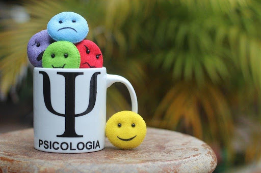
Experts believe that colors affect our moods, emotions and feelings. Seeing warm or soft colors such as red, orange or yellow can make us feel calm, happy, relaxed and full of energy.
On the other hand, looking at dull or muted colors such as grey, cool blue, beige etc., can make us feel dark and gloomy. The brightness and tone of color have a significant impact on our emotions and thoughts.
For example, red can increase our appetite while also grabbing our attention and signaling our brain that there might be danger ahead.
A research study found that better quality infographics on a website, including warm, inviting colors in the visuals, helped increase the conversion rate of customers by 24%. This is because our brains can't read and absorb all the information listed on a website, even if it's divided into small paragraphs and bullet points.
Using the power of colors helps you get the message across to the reader in an easily digestible way. This way, readers can grasp important information on a website within seconds of opening it.
Let's go deeper into the psychology of color and understand how it can help improve website SEO.
The Role of Color Psychology in the Digital Arena
Color psychology is the scientific study of how colors affect our emotions. It's a sub-field of the broader field of behavioral psychology. Research published in a peer-reviewed journal claimed that a customer makes up their mind about whether or not to buy a product or a service within 90 seconds, and almost 62 to 90% of their decision is based on the power of color.
The power of color psychology lies in how well you use colors to create a visually appealing site that attracts customers and keeps them engaged. This means understanding how to harness the use of color, tone, brightness, saturation level, and more.
In America, the two most popular colors used in websites are red and blue. However, many customers think blue is a depressing and melancholy color. Hence, the best way to determine which colors to use to improve website SEO is by narrowing down the target audience.

How To Choose The Right Colors For The Right Audience
If you wish to reduce your site's bounce rate, you need to use colors in the right way, at the right time, with the right audience and for the right purpose.
For example, survey results have shown that women like blue, green, and purple colors and don't find the colors grey, brown or orange attractive. Most females are put off by these earthy tones and prefer to look at products or webpages decked out in primary colors.
Let's take L'Oréal for instance. The company targets their shampoos and conditioners and other hair care products mostly to women. Their webpage features two primary colors, white and black, overlayed with purple. The purple color appeals to women, and customers are therefore inclined to buy products from the L'Oréal website based on the site's color scheme.
Another example is Milani Cosmetics that targets cosmetic and beauty products such as lipsticks and makeup to women. Their site features a black background with pink headers and red highlights. These bright tones appeal more to women and entice them into browsing the site for longer.

The Right Choice Of Colors Improves User Experience
While technical factors such as on-page SEO, loading time and image optimization helps to improve website SEO, you can also use colors to your advantage and create a better user experience for your customers.
Good user experience plays an important role in a website's SEO, and increases the dwelling time of customers or their return rate. Plus, Google's algorithm takes user experience into account when ranking sites in search results.
To choose the right color scheme for your website, you need to determine the kind of user effect you're aiming for. For example, you may use bright colors with bold tones such as red and orange to energize readers and capture their attention.
However, if your website aims to project calm and elegance, it's a better idea to use soothing tones and warm hues such as light blue or soft lilac.
When choosing colors, you also need to consider their tone and saturation. The color purple with a dark tone can convey luxury and sophisticated chic. However, a light toned purple gives off a playful, romantic and light-hearted vibe.

Decide Where To Use Color For Maximum Effect
You can also use colors to highlight various website areas, such as headlines, borders, buttons or popups, background, menus, sidebars, logo, contact info such as phone number or email address and more.
You may have noticed that most websites use black as their primary text color. This is because black is prominent and easily distinguishable, making the site more readable.
Another important consideration is using the same colors for logo and branding.
Customers interact with a brand's reputation and are loyal to brands they feel familiar and comfortable with.
Recognition value is important to properly market and advertise your products to see return customers and a higher conversion rate on your website. Hence, if you've already made a logo or a design that you use on your products, use the same colors to create a unique brand look that your customer base will instantly recognize.
Direct Your Customer's Attention With Different Colors
You can use colors as a map to guide your customers along the route you want them to take when they visit your website and decide which links to open or which page to click on.
One way of doing this is to use a different color to highlight a text link's background, so it captures the user's attention and makes them curious about the page and the information it contains.
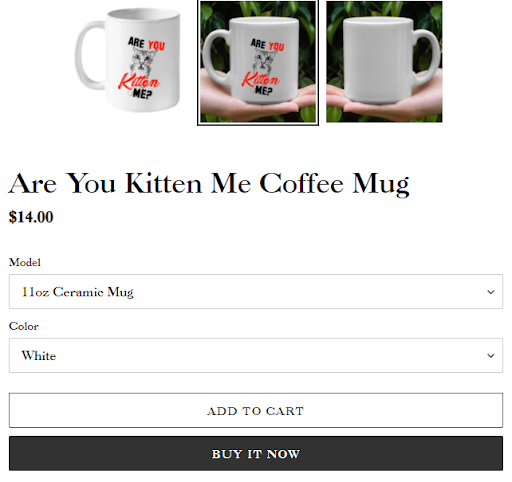
Another great way to direct your reader's attention is using bright colors for call-to-action buttons. Using colors like red and blue for buttons like "Buy Now" or "Add to Cart" makes it easy for users to know where they need to click to take action.
Here's an example of shopping site that uses black call-to-action buttons:
 <
<
Using different colors also makes your headings stand out and sets them apart from the overall web page layout, so they're more emphasized. For example, you can have a subdued blue color background for your webpage and use a darker blue to highlight and give importance to headings so readers can see how the website is organized.
Improve Readability And Build Trust
Websites must have readable content on their pages for customers to quickly scan the page and gather the information they need.
Using bright colors for text helps improve readability for users, which means they can quickly browse through the website content and be persuaded to buy a product or a service due to its listed advantages.
The colors of a text also help break down the monotony and make the text more accessible to users, especially those with color-blindness. Color deficiency is present in more than 8% of men and 0.5% of women, so to improve website SEO, you need to have readable content using the right choice of colors.
Take a lot at this screenshot of the PayPal homepage with a bright blue color scheme:

Many companies use the color blue to ensure they appear trustworthy in their customer's eyes. For example, PayPal, which deals with billions of dollars every day, uses blue color in its main theme and branding.
Similarly, websites that want to promote eco-friendly behavior and display their sustainability efforts often use the color green. Green is known to increase feelings of calmness and peace and inspire bursts of creativity. Hence, many websites use green in their call-buttons to encourage their customers to click the button, increasing their conversion rate and improving their website SEO.
This contributed article was written by Joseph Dyson, an expert at how to improve websites' bounce rates. He offers expert website SEO and link building services to help clients optimize their websites and maximize conversions.