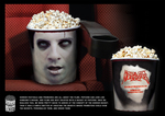
Apparently because popcorn can look like a person's brains, a pair of Y&R New York interns, Paul Wood and Milan Daniels, developed this popcorn packaging for Motor City Nightmares, a Detroit horror convention. The buckets, in support of the event, were available for order online and could be personalized.
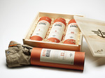
To introduce a new line of Dockers, Draftfcb San Francisco shipped 600 online customers three pairs of new khakis in containers resembling scotch or whiskey packaging. The new khakis come in three different finishes - one-year Scraped, five-year Dirty and 10-year Destroyed
"Dockers 'Wear The Pants' Campaign is all about masculinity and there's nothing more inherently masculine than a bottle of aged whiskey," said Julie Scelzo, SVP, group creative director of Draftfcb San Francisco. "The idea came to us from the different aged finishes, which we thought would serve as a great parallel to a fine whiskey."
- It's not only boobs that cause ads to get banned. Butts do too. According to the Russian Office of Federal Antimonopoly Service "indecent image of a woman's body cannot be placed in a public place."
- I'm on a boat. Absolutely nothing to do with advertising. At all. In anyway, shape or form. But it is hot. Bikinis, rap, profanity.
- Nokia HTC stunt backfires.
- There's a lot of ways to promote your bingo site. This is one of the more, um, odd methods.
- Pope your ride.
- Draw your own conclusions about Cornelius Trunchpole.
- Speaking of Cornelius Trunchpole, Sound Lounge has an interview with the man. The joke gets even more preposterous.
more »
Never mind Birkin bags and pretty scarves. The object at left is a new and insanely luxurious piece of social currency dubbed WHY -- the Wally Hermes Yacht. Outfitted with 900 meters squared of thermophotovoltaic panels (that's their way of saying it's also green), it was designed in partnership with Hermes and a company called Wally, which specializes in futuristic boats and yachts.
The pricey contentment-eating boat porn was dropped into our laps by Wisey, author of The Digestif, who told us that WHY takes Hermes' luxury ethos to a new level: don't just sport your means around your neck or on your arm: LIVE INSIDE IT. Alongside whales or off the coast of Greece!
more »
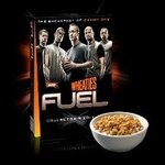
So Wheaties, the wholesome man's man cereal that once sported Michael Jordan on the box, has rebranded to reflect our taurine-powered, chrome-enhanced times.
Powering down on all that orange, the new Wheaties box is Basic Black with a metallic new brand name: FUEL. Just above is a casual (and yet not) assembly of sporty dudes with features that bring both Star Trek and Axe to mind. Yes, simultaneously.
No word on whether the Bom Chika Wah-Wah will be penetrating TV ads; we just hope all that FUEL doesn't manifest itself on unwitting tastebuds.
Make the Logo Bigger has a good assessment of why this approach sucks for cereal. In contrast, Plaid's Brand Flakes for Breakfast admits the box'll stand out -- that is, until all the other breakfasts of champions start following suit.
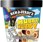
It won't, just ice cream trucks in Vermont. Ben & Jerry's have renamed one of their flavors to recognize Vermont's gay marriage resolution. (Other states recognizing same sex marriages under the law: Massachusetts, Connecticut, Iowa, Maine (beginning mid-September 2009), New Hampshire (final legislation pending), New York and Washington, DC recognize same sex marriages from other states, California recognizes those married between June-November 2008, Hawaii offers limited benefits and Oregon offers benefits similar to marriage.) The flavor getting the sex change was originally Chubby Hubby. Cue floodgates as other brands follow suit?
The wtf-is-that at left is actually a business card for AGRIE Paint Services.
It may not look like much, but pull that green tab for one of the most gratifying experiences: peeling electrical tape back from a freshly-painted wall.
Post-peel, here's what you find.
Pocked-sized wonder,* dreamed up by Extreme Group, Toronto.
more »
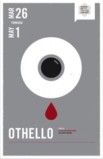
We dig the theatre, especially reworkings of Shakespeare and his frothy contributions to the perpetually-tragic human condition, so these posters for the Denver Center Theater Company hit us in a smushy spot.
Meant to promote a 10-play series targeted to more youthful play-goers, the posters each take a play (Shakespeare or otherwise), then interpret it in contemporary symbology and use a few words to encompass the heart of the drama.
The posters are two-sided. One side is for the imagery and the name of the play; the other side is for the text. At left, the eyeball and the drop of blood represent Othello. The other side reads, "Who can you trust when you can't trust yourself?"
more »
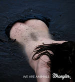
Last night was the Cannes Lions awards event for Design, Press and Cyber efforts. As always, for the full list of winners, go hithery-dithery. But here are the Grand Prix winners for each category:
For DESIGN: "Paper Battlefield" for Nike Hong Kong by McCann Worldgroup/Causeway Bay.
For PRESS: "We Are Animals," that creepy bejeaned-human-meets-carnal-instinct campaign by FRED & FARID/Paris for Wrangler.
For CYBER: "Best Job in the World" -- which is seriously cleaning up this year -- by Cumminsnitro/Brisbane for Tourism Queensland.
"Eco:Drive" by AKQA/London for Fiat also scored a Cyber Grand Prix, as did "Why So Serious?" for Warner Bros.' The Dark Knight. The latter campaign is a typical piece of elaborate genius by the folks at 42 Entertainment/Pasadena, whose every project is not so much advertising as it is grand oeuvre.
more »
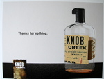
So Knob Creek, due to demand for its bourbon, is running low on supply and is at risk of running dry before its next batch is ready in November. Rather than bottle the next batch before its full nine year maturity, the comapny has turned its lack of product into a promotion. A sick joke of a promotion but a promotion none the less.
We've been sent all sorts of goodies from marketers in the mail. Sadly, most are of the throw-a-way variety. This is most certainly not the case when it comes to liquor, unless you consider pouring the product down one's throat throwing it away.
more »

|
|


