
Students Bring Wind-Whistling Mustang Blur to World at Large
Entry update: Balendu at Adpunch brings our attention to a series of Mustang billboards that actually blur the scenery behind them. The idea is to lend drivers the impression that Mustang drivers see the world in hyperspeed.
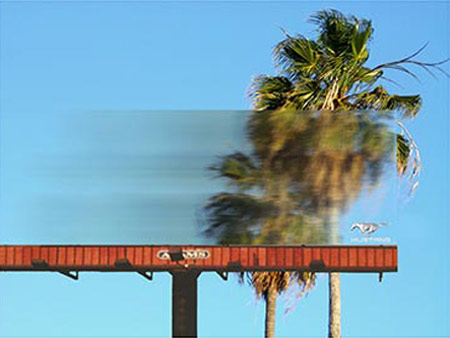
Created by Miami Beach Ad School students Ian Hart and Annie Williams, the work takes a traditional medium largely ignored by its audience and turns it into a frame through which any passerby can see the world from the perspective of a very sleek vehicle. The board is made of GE Lexan EXL semi-transparent resin and blurs the scene behind it regardless of the weather.
Considering billboards are noted in a split-second if at all, it may help to make the logo bigger for once (thanks, Paul). Bold black copy may also bring the concept into sharp relief.
That aside, it's a better effort than whatever marketing manpower Ford has (or doesn't have) behind Mustang now. We haven't heard so much as a purr from the big steel horse in the ad world lately.
Comments
i've seen this before and it's a piece from a student book. i love the concept but ... i think critiquing student work deserves its own time and place, don't you?
i've seen this before and it's a piece from a student book. i love the concept but ... i think critiquing student work deserves its own time and place, don't you?
I highly doubt that those are actual billboards Ford's paying for. Looks like someone's clever idea that never got executed.
I dunno, the concept seems pretty easy to pick up on, and the blur is just unique enough to be eye catching. Someone should be able to glance at it and say "oh yeah, fast... that's sorta clever".
But you're right about the logo. This is one case where the client's request to "make the logo bigger" rings true.
it's from a student book. nice try.
http://ianhartcw.com/mainpage.html
it's from a student book. nice try.
http://ianhartcw.com/mainpage.html
it's from a student book. nice try.
http://ianhartcw.com/mainpage.html
This advertisement is student work created by Ian Hart and Annie Williams at the Miami Ad School Miami Beach Campus. Constructed from GE Lexan EXL semi-transparent resin, the billboard accurately blurs the scene behind it regardless of day, weather, or season. The billboards are student work only, and were never produced.
Steve does this mean I can now dig out some of my TV and film work from Oklahoma State University in the 1960's and make them pay?
Don't just settle for making them pay, Roy. Make them cry.
i think the idea is strong and the execution of the comp is fantastic. Well done Ian & Annie. Nice use of creative problem solving skills that convey the product feature / benefit quickly
http://www.reelspit.com
Like always : excellent ideas never get the credit !
I'm sure that in the future some agncy will copy the idea and pitch it to a client ! Ian will lose the idea
Has it really run? Who had said it did?
I just hope--if it didn't run--the students are not trying to pass it off as if it had. That's a big no-no and not a good way to get noticed.
Otherwise, it's a good student visual. Made me click on the portfolio link to check out the other work. The Tampax work made both me and my partner cringe. My advice is to make sure cleverness doesn;t get ahead of relevance and insight. That's what seperates good advertising form something like...say, Leurzer's global archive of visual punnery.
I work for Adams, and to my knowledge we've never installed this board in any of our markets. Great concept, but slightly unrealistic that any substrate could be supported without a frame. Kudos on the design though - very progressive use of the medium.
If it can be dreamt up, it can probably BE MADE to happen. I hate when people say something this simple cannot be made. And for some reason,there are many in the industry. A creatives job is to dream stuff like this up. No substrate can hold it? Let's ask the media co to try and develop one that does. It won't work? Let's figure out how to make it work. This idea isn't that far-fetched. It's not writing on the moon.
All I hope is that this guy ends up working at a place that values ideas that say "I've never seen it before--but let's try and make it happen." Granted, there aren't that many places that would--but that's what makes those places all the more special.
Right on, Tim!
Agreed, Tim.