
De Beers Co-Ops Botticelli In Campaign
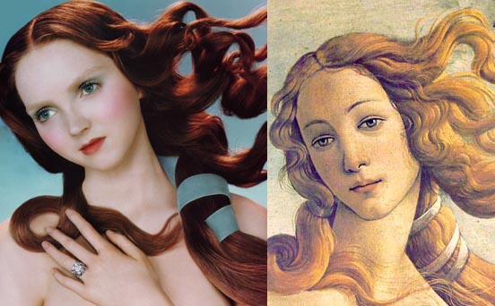
In a recent ad campaign, diamond giant De Beers has modeled their advertising after Botticelli. The ad currently appears in the July issue of Town and Country. It appears as a spread with this image on the left hand side. For fun, the full Botticelli image is here. Thanks to Adrants reader Christopher Peterson.
Comments
Geek-fact # 4,567,094. Botticelli's Venus was also the basis of the product iconography of Adobe Illustrator for years. And then it was retired when Adobe went all "CS". Interesting piece on the ideology behing the transition of the iconography here:
http://www.creativepro.com/story/feature/22837.html?cprose=daily
The geeks in our office were confused at first after looking on Venus for so many years.....
awesome, i love geek-facts like those
Damn, McThingy...beat me to it.
I, too, was confused for long time after I upgraded to CS. After over a year, it still doesn't look right to see a chysamthemum (or whatever) in place of Venus on an Illustrator icon. I think it's a good argument for not fucking with an established branding image if you don't really have to. Update, yes...but change completely? mmmm...no.
As for MetaDesign's rationale...meh. Sounds like so much marketing splooge. The icons come up short in their stated, psychological mission and fail completely in their contextual mission...ease of differentiation between files from different apps. Their familial prettiness works against differentiation. They sure make for pretty packaging, though.
Yeah -- the packaging is rather spiffy. I wonder if they'll change the Macromedia look and feel now they've bought them. I kind of like the Macromedia sparse-'n-spare corporate look 'n feel.
Yeah -- the packaging is rather spiffy. I wonder if they'll change the Macromedia look and feel now they've bought them. I kind of like the Macromedia sparse-'n-spare corporate look 'n feel.