
Creators of Wonderbra Spec Ad Beg For Coverage. We Relent
OK, OK OK! We don't usually highlight spec ads but because no less than nine people have sent us this video, we guess there must be some kind of demand for it so here it it. Believe it or not, we've grown tired of Wonderbra's wacky efforts at advertising its supportive devices but it seems many have not including the creators of this wannabe ad.
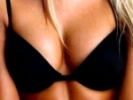
The "ad" uses the age-old visual trick of the revolving spiral that, when stared into for a while, can make the following image appear to move as well. In this case, it's a pair of bra-clad breasts which seem to continuously get bigger. Yet another witty representation of the apparently magical breast enlarging qualities on Wonderbra.
Our favorite bra ad, though, is still the Chantelle Push-Up bra ad which illustrates the bra's uplifting qualities and its effect on a woman's cocktail dress. We just love how clothing is sometimes oddly affected bu the size of a woman's breasts. Oh, damn, Did we just admit to some sick fetish publicly. Ooops. Sorry about that.
Comments
Trippy. I suddenly don't want to smoke anymore. And repressed memories of gym class are resurfacing.
another spot for the same brand from Singapore.(?)...
http://veryfunnyads.com/ads/25687.html
Sorry, but that ad was really... stupid. The spiral goes on way too long, and the resulting effect defines "meh". The YouTube quality makes it even worse. Your simple still image accompanying your post is FAR more interesting than that pointless time-wasting video.
You've probably only grown "tired" of really bad ads like this one, not Wonderbreasts.
Wow. How utterly lackluster and without the slightest concept. I agree with the previous commenter - the still photo was more compelling.