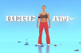
Over at Gawker, Nike is taking a beating for a new slogan it's testing in a new campaign targeting women in Europe. The tagline, "Here I am" is humorously pointed out to have, well, and interesting relationship with the parent tagline,"Just Do It." The relationship? The actionable "do it" portion of the parent tagline is seen to be a bit, well, awkwardly demeaning when placed next to the more submissive "Here I Am."
So is Nike telling the bulk of its audience to just do it with submissive women in Europe who will just lay down and say "here I am?"
more »
As you likely know, we love to trash bad work here. We think it's our strong suit. We also have a short attention span and, thankfully to many, don't often go into lengthy detail in our trashings. But, we can appreciate and point to others who don't seem to have short attention spans and who take a keen interest in ripping apart every conceivable element of a piece of work.
Recently, new NBA franchise and former Seattle Supersonics the Oklahoma City Thunder unveiled a new logo and Denver Egotist commenter Bubba did us proud slamming every element of the work. Another commenter writes, "a team that steals basketball away from a deserving city because of an owner who wants to take his ball and go to his hometown (and much smaller city at that) deserves a shitty logo."
Need we say more?
In an internal letter obtained by TechCrunch, SVP Bill Veghte tries to explain WTF Microsoft was getting at with its Seinfeld campaign, which kicked off with this really weird ad.
Excerpt from Veghte's letter:
Today, we are kicking off a highly visible advertising campaign. The first phase of this campaign is designed to engage consumers and spark a new conversation about Windows - a conversation that will evolve as the campaign progresses, but will always be marked by humor and humanity. The first in this series [...] aims to re-ignite consumer excitement about the broader value of Windows.
more »
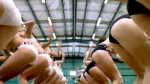
This Cutwater-created commercial for Levi's is stupid. Yes, it's not polite to stare and objectify by either sex but come on! We are all human. We are all sexually attracted to one another. It's natural. It's innate. It's normal. Just admiring the beauty of another human doesn't mean we are all lecherous sex maniacs deserving of a body slam. Sometimes it's just nice to look at and appreciate pretty things. It isn't always about dirty thoughts
And by the way, the pretty things who get looked at, male or female (which, by the way, that stupid PC ending in the commercial is just stupid), shouldn't always assume the onlooker is out for anything more than the pleasure one derives from looking at a beautiful painting in a museum.
Cut the scrap, Cutwater. Your sunglasses idiocy was better than this!
It's well know Diesel does some weird/interesting/racy/bad advertising. They did that global warming thing. They did that two-hotties-in-a-room-S&M thing. They did that Aarif Smaks dance instructor thing. Now Diesel offers up some photogasmic "fuel for life" for, well, its Fuel for Life line of fragrance for women.
more »
It's quite clear some people get excited about their vehicles. Some more than others. They will dance, they will prance. They will sing, they will swing. They will commend, they will recommend. They will rave, they will praise. They will aggrandize, they will advertise. They will dramatize, they will hyperbolize. They will amplify, they will magnify. But will they go operatic?
If said excited are fans of "The More Grand Cherokee," then, oh yes, yes they will. And they will do it with gusto and with pride. Excitement and glee. Admiration and pride. Appreciation and idolization. Glorification and sentimentalization. Oh yes, forthright and dedicated, these car nuts will express their love no matter the oddity of the expression.
more »
Apart from the fact Dos Equis' Most Interesting Man in the World conjures, somewhat, Charlton Heston's Moses (or is it George Parker?), he's well, just not that interesting in this second outing of the campaign. That's par for the course when a campaign initially breaks from the mold and then tries to maintain that break over time. What was once new and different now becomes "Oh, it's those weird Dos Equis ads again." which, in some respects, isn't such a bad thing in this era of continuously changing brand direction before the consumer has a chance to understand the initial direction.
Euro RSCG is behind the campaign which consists of three television spots which you can view here.
Wait, what? Is Diddy, P. Diddy, Puffy or whatever the hell he's now calling himself still a musician or has he completely sold out to marketers? It certainly seems so because the only place the guy seems to appear anymore is in commercials. Now he's doing one for Burger King in which his cartoonish, self-important, overinflated ego is on full display.
more »
Unlike most accounts where a little bit of pre-concept research is always a good thing, working on a women's lingerie or underwear account requires nothing more than a Neanderthal mentality and the libido of a 16 year old high school kid. It's like the creative brief writes itself.
Hmm. Let's see. Ooo...I've got it. Dude, it's lingerie! We'll show the product! And we can get a shit ton of hot babes for the shoot! And all they'll be wearing is underwear and bras! Dude, this is gonna be hot! And we'll have them play some choreographed girl on girl patty cake so we can get a little jiggle effect going. Dude! Bitches fighting! That rocks!
Up until the final tagline, "Your five senses prefer a Renault Magane" (which you have to listen to over and over to understand), this Brazilian commercial for the Renault Megane instills that sense of brotherly love you get when...well...you crowd surf your way home from work while some techno plays in the background.
more »

|
|