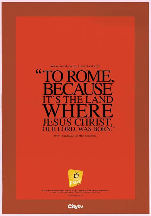
This series of ads by JWT, Bogota promotes CityTV at the expense of beauty queens. The text reads "A beauty contest is about beauty, but you've got to draw the line somewhere."
Well, a pretty girl is a dime a dozen, and pageant girls know that to win a beauty contest they have to seem spotless on the inside too. So they come up with the most robotic, naive responses imaginable, which happen to be really awesome fodder for ads. The quote at left is a response to the question, "Where would you like to travel and why?" And one ad about the pope and Mother Theresa just killed us. Adverbox has more.
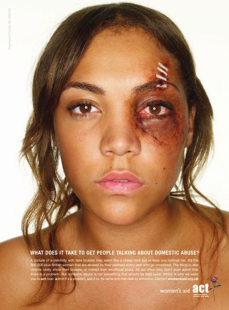
We've seen plenty of domestic violence ads, but this campaign actually makes us cringe. For Women's Aid, agency Grey London paints bruises onto celebrity faces and plasters them far and wide, hoping people would look, recognize, gasp in horror and decide to get comfortable with talking about their own secret bruises.
Granted there are some conversations that started out taboo and are now part of the public tell-all, like routine plastic surgery. But domestic violence is a deeply personal, humiliating affair, almost always entangled in feelings of love, loyalty and fear of stigma. We doubt any one series of visually traumatizing campaigns will help start a casual discourse about it in a public space. And in the States, you actually do need to have a bruise before you can even report anything. Kind of defeats the purpose, right?
AdPunch has more images if you want to take a look.
Santa Clara agency throws together several ads for Unifieo's Export Quality Courses, programs made to teach Brazilian youth global skills. The ads encourage them to take the courses, which could lead to positions better suited than under-the-table positions for the self-entitled and sexy. There's also an au pair and cook variation.
We think the imagery is gorgeous and mixed with subtle irony. While Brazil trains youth to find better jobs outside the country, American post-collegiates break the doors down in Europe and South America for plebe positions, aspiring to live out overseas fantasies that would do Marie Antoinette justice. Priority issue? Despite the uncute factor of underpaid all-hours work, Brazil sees no end to young hot foals willing to take them.
This series of ads for Condor Child's Toothbrushes gets the point across and probably attracts their demographic of choice in a big way.
We played with the idea of how awesome it would be to have a toothbrush with a crayon on the other end, then realized that initiative may result in a completely opposite effect from this ad. When you're a kid, it's amazing what seems worth eating. We preferred glue ourselves.
The agency responsible was OpusMúltipla out of Curitiba, Brazil.
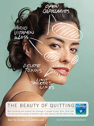
Instead of harping a self-righteous "smoking kills" or "quitting can improve your quality of life" message with some skipping in the flowers imagery, NicodermCQ takes a different tack: it hawks its nicotine patch as an age lifter and clarifier.
Clever. We all know what the detriments associated with smoking are; the only problem is that tools for quitting just aren't as cute as the sultry puff-puff. Considering some women already use a patch for birth control, looking upon a nicotine patch as a beauty tool may be just what the doctor ordered.
Apparently, the streets of Milwaukee are vry dirty in Winter and a recent bank transit campiagn has taken advantage of that fact. For North Bank, Stir created several bus boards that appear dirty and have messages scrawled on the boards similar to scrawling a message on the back of a dirty car or a foggy window. The messages are responses to the boards' headlines that reflect what people might say after reading the headline. Our fav is "We don't hide fees" followed by "Does that cost extra?" See them all here.
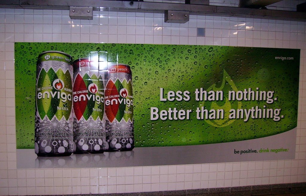
Purveyors at Coke and Nestle are greeted this new year by a lawsuit from the Center for Science in the Public Interest because of Enviga, a pilot beverage that playfully assures you'll burn a whopping 60-100 calories after just three cans.
We'll be slightly nicer than Copyranter and say sure, that's more than possible. Walking to your car, getting in, buying a six-pack of bullshit and raising and lowering your arm as many times as it takes to down half of that could possibly burn 60-100 calories. Not to mention the brain cells you burn during ingestion, which are notoriously heavy.
To be fair it's not like Enviga was the first to encourage the all-too-willing to eat and drink more for weight loss. We totally fell for the pasta-chocolate diet.
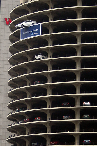
AllState, best known for its mild-mannered commercials and provocative slogan, "Are you in good hands?" conducts an out-of-character but well-orchestrated PR stunt with the help of Leo Burnett.
In the subsequent ad a man on a mission steals a vehicle and drives it surreally off the top of a Marina City parking garage in Chicago. And just when you're like "OMGWTFBBQ," that soothing meme of a tone takes over: "AllState. Are you in good hands?"
Nervous laughter all around.
This print ad, where a Grand Am teeters precariously over the edge of that same parking structure, follows up on the idea.
AllState, typically favouring the soberest of marketing stances, surprised us with this one. It's a little like God making a joke at our expense. We're sure they got some good buzz out of the deal and maybe even an account or two since people accidentally drive off narrow parking structures all the time.
Doodles are coming back in a big way as suddenly everybody's under the impression they say a lot about you.
To perpetuate this strange idea Lunar BBDO creates a doodle campaign for UK-based Samaritans, which according to the website provides "emotional support for people who are experiencing feelings of distress or despair, including those which may lead to suicide."
Creative director Daryl Corps tells AdCritic, "If you stand close to the poster you'll see the detailed doodles -- but stand back and you'll see that these doodles make up the image of someone who should contact the Samaritans."
Suddenly we want desperately to hide the desk calendar we've been idly doodling on for the last year. Our little pinwheels, inky slashes and bug-eyed monsters make us feel very naked in the face of all this concerned scrutiny. Didn't Patrick Bateman of American Psycho do a lot of doodling too? Look at that. One day you're doodling; the next day you're trying to push a live cat into an ATM machine.
DRGM Las Vegas celebrates its agency femmes by creating a pin-up calendar of said women - except they're all being parodied by the agency men.
DRGM creative director Bernice Bamburak explains, "[T]hese guys make us look sexier than we are -- did you see the legs on Miss July?" She also notes that clients, who know both the men and women in the agency, love the idea. Last year the women parodied the agency men.
We need to create a compendium of all the ways this pin-up concept has been abused in the name of things like cheese, theatre, coffins and even fat as pets. What happened to the days when things were simple and we just took pictures of girls with pom-poms and team-coordinated bikinis?

|