Why? Why? Why? Why do brands launch these massive campaigns, spend all this money and make ads that don't say a thing about what the company does? Are there people in agencies that still think "branding" without meaningful substance works? Apparently, not after one of those day-long, mind-numbing vision, mission, essence, position self-serving mind fucks. After that, they're all sipping the Kool Aid without realizing the consumer wasn't in that meeting all day and has no idea what the hell the resulting brand messaging is trying to convey.
Sure, this Mobius award winning Bart Domination campaign for Kaiser Permanente will certainly force the company's name into the conscious and subconscious mind of everyone within eye sight but will they walk away having any idea what the company does? Oh wait. Yea. There's this thing called the Internet. Oh wait. There's no URL in the ad. Oh wait. There's this thing called Google. It helps you find stuff. Oh wait, Kaiser's name is impossible to spell. Even if one does find their way to the site, it doesn't even tell you what the company does. Not until you click in several levels or visit the far more helpful Wikipedia listing. And yes, we have heard of Kaiser Permanente before and many people in California, where the campaign is running, have as well but that's not the case with most other marketer's that go this route.
So why? Why? Why make your potential customer work when you only have a split second of their time? Why paint pretty pictures that are devoid of commercial messaging. This isn't art. It's advertising. Wallow in the beautiful non-descriptiveness of this campaign here (PDF).
Oh, and the explanation for why those tree trunks and their copy look fake: "Apparently the photos taken of the installation were not very good and someone thought they could be improved by photoshopping the copy that was on the pillars onto the already poor quality photos."
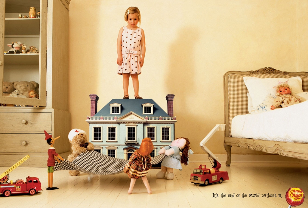
We've done stupid dads, talking animals, women in bikinis, rape, humor, shock, poignancy, cavemen, rodents out of a cannon and hundreds of other hooks to get people to look at our ads. The meme of the moment now is suicide. GM did it. VW did it. Now we have children contemplating suicide for...lollipops. Yes, Chupa Chups thinks it's the end of the world without their lollipops with girls contemplating a jump from atop a doll house and boys contemplating death by milk. Surely the Center With Nothing to do But Complain About Innocuous Ads will have something to say about this one.
Now here's a spot that's so bad, so cheesy, so predictably poor in it's use of t double entendre, it's actually good. It's an Australian spot for Tite-Tie, a product that helps tie things down in tandem with rope. And yes, we know this isn't new. See it here on the Tite-Tie site or a director's cut here on YouTube.
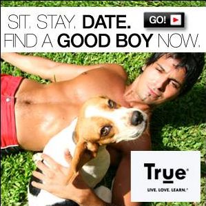
MySpace, True.com's banner whoring stomping-ground, is running an ad that's made us double-take at least six times thus far.
Are they saying men are like dogs? That men should seek out dogs instead of women? That either one of the sexes should go canine and not carnal?
They also appear to be addressing us in pup language. Sit. Stay. Date. Bark? Jump? How high? It didn't occur to us how condescending True can be, not merely in language but in branding, until just now. Is this what we've come to? Docile men, interchangeable sex kittens and one-word commands?
Well, maybe. Despite the lackluster appearance of its website, True destroys competition in the dating world right now. So tonight we've decided to hit a bar and ask members of the opposite sex to wag tails and play dead and see if it gets us laid. There's a whole fetish industry that revolves around collars and commands, so we're feeling optimistic. Thanks, True.
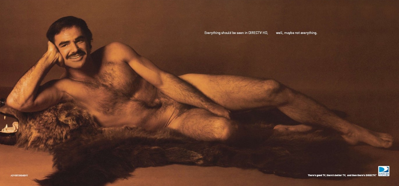
Back in the dark ages of the seventies when women thought men with tons of body hair were sexy, the very hairy Burt Reynolds graced the pages of Cosmopolitan with his famed centerfold pose. If only Philips' Shave Everywhere could have been on the scene. My how times and styles have changed. Today, men and women can't seem to get enough hair off their bodies. In the seventies, hair ruled.
Acknowledging hair length and style never stops changing, perhaps DIRECTV thinks it's ahead of the curve here and we should expect some sort of Shave Everywhere backlash with chest and pubic hair making a rampant return after having been tamed for so long. Or, perhaps, as the "Everything should be seen in DERECTV HD. Well not everything" headline indicates, the satellite company just wants to grossly counteract the usual satisfaction one feels when paging through the annual Sports Illustrated swimsuit issue in which this Burt Reynolds ad appears.
This hairy seventies freak show comes to us courtesy of Deutsch LA.
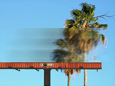
Entry update: Balendu at Adpunch brings our attention to a series of Mustang billboards that actually blur the scenery behind them. The idea is to lend drivers the impression that Mustang drivers see the world in hyperspeed.
Created by Miami Beach Ad School students Ian Hart and Annie Williams, the work takes a traditional medium largely ignored by its audience and turns it into a frame through which any passerby can see the world from the perspective of a very sleek vehicle. The board is made of GE Lexan EXL semi-transparent resin and blurs the scene behind it regardless of the weather.
more »
Swedish group Garbergs uses the "Cribs" angle to push the multi-faceted new line of models by Mitsubishi. At Not Everybody's Car we explore the garage of LA inhabitant Action Jackson who of course is ostentatiously hip-hop and has a showroom-caliber set-up of cars that flash and buzz when you mouse over them.
Hiding an interactive test-drive opportunity in the "Cribs" and hip-hop motifs is a clever way to generate brand buzz. Oh, except that it's not. Nobody buys this stuff anymore. "Cribs" is played-out and everybody tries to use the hip-hop angle. When we're bored, we don't sit around cyber test-driving cars with our bosom buddy Action Jackson. We play on Digg so we can talk shit about big companies that try to trick us, share WoW tips and swap really important news generally related to Apple.
Like the queen bee on the quad, some people just get off on making other people look lame in comparison. We're guessing that's how this spot for Vilara is supposed to encourage people to go there. Apparently Vilara is super-awesome because chavs (a slang term for working-class uneducated folk, according to handy Wikipedia) don't know where it is. And the website notes places only get It status when they're virtually unheard-of.
So why advertise for it? Who are they talking to exactly? Won't this in fact make chavs aware? Does that mean they stop being chavs? And what TV-watching demo will actually be relieved that the topless kissing chicks featured in the ad won't be at this dream spot?
This skin-crawling ad for Embarq so thoroughly grated the nerves on Bill that it gave us an uncourted sense of schadenfreude. In general, something about the ad embarrasses us in the same way your immortalization in the yearbook embarrasses you.
It merits adding that Embarq, who consider themselves trailblazers in the direction of common sense, will probably make good on a spot this annoying. It sort of clings, like toilet paper or static.
We're thankful that the song hasn't lodged itself in our heads yet but that's mainly because we're afraid of watching the spot a second time. We might catch '80's hair. And nobody wants that.
No idea's original, but in any field the taboo is the same: if even a successful idea can be traced back to somebody else's sleeper hit, fingers get pointed. For a shining example, just look at Suzuki's attempts to be BMW.
A source tells us elements of the STA World Traveler Contest are suspiciously similar to an existing campaign that's lesser-known but more complete in scope. St. Georges School in the Grenada West Indies used the same pinpricked-globe format to highlight, not starry-eyed co-eds, but far-flung alumni they've accumulated over 30 years. Visit the St. Georges website and click on the 30 year anniversary logo at bottom left to catch the similarities.
If you don't feel like clicking back and forth, that's okay; we'll show you.
more »

|
|