We felt pleasantly provoked by this ad for Marithe + Francois Girbaud, in which female models take up the mantles of Jesus and the Apostles for The Last Supper. There's also a man that we're guessing is supposed to be a Magdalene, or maybe a Judas, figure.
We love how the viewer is first slapped with recollection of the Da Vinci original, but beyond that the image merits a good long look. The facial expressions are wildly illustrative. And there don't appear to be chairs or table legs.
more »
We think there's something delicious about these Sundek ads by Callegari Berville Grey, Paris. We have no idea what they have to do with surfwear, but something about dripping bodies (albeit with membrane, which ain't exactly sexy) and the promise of giant omelets makes us salivate in a manner most bib-worthy.
Variation here. The sex/egg combination appears to be a French favorite.
Update: Adrants reader Duncan adds depth to perception by noting the surfers must be sea turtles, which hatch on shore and live out the rest of their lives in the water. Ohhhh.
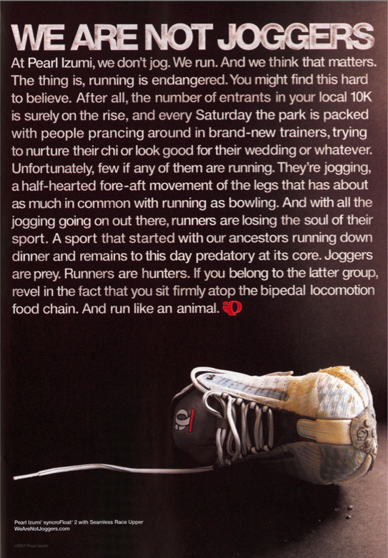
We're usually big typography fans, but, as AdCritic so eloquently points out, this Pearl Izumi ad is bordering on Pearl S. Buck territory.
And not all that well, either. The elitist mini-rant against jogging is cumbersome and a pain in the ass to read. Oh yeah, and way to alienate all of Evian-sipping, yoga-posing jogger-kind. Care to turn off the sprinters and trotters next? We're pretty sure they don't need tennis shoes.
For more runner's manifesto (11 pages worth, in fact), hit the We Are Not Joggers website.
- Reader's Digest has just announced it will now accept ads on its back cover in January...and cut circulation by 20 percent. Hmm. Guess things aren't going so well.
- Any iPhone spoof that has the copy, "I'm drunk as fuck and I'm driving down the Interstate" is good in our book.
- Uppity blogoshereites aren't taking kindly to McDonald's latest blogging efforts in which the junk food giant has enlisted six "mommy bloggers" to tout the wonders of carrying Big Mac in one hand and a screaming two year old in the other.
- As if teachers haven't yet been disrespected enough, The Learning Annex educational institute has offered Paris Hilton $1 million to teach budding entrepreneurs her secrets behind branding.
more »
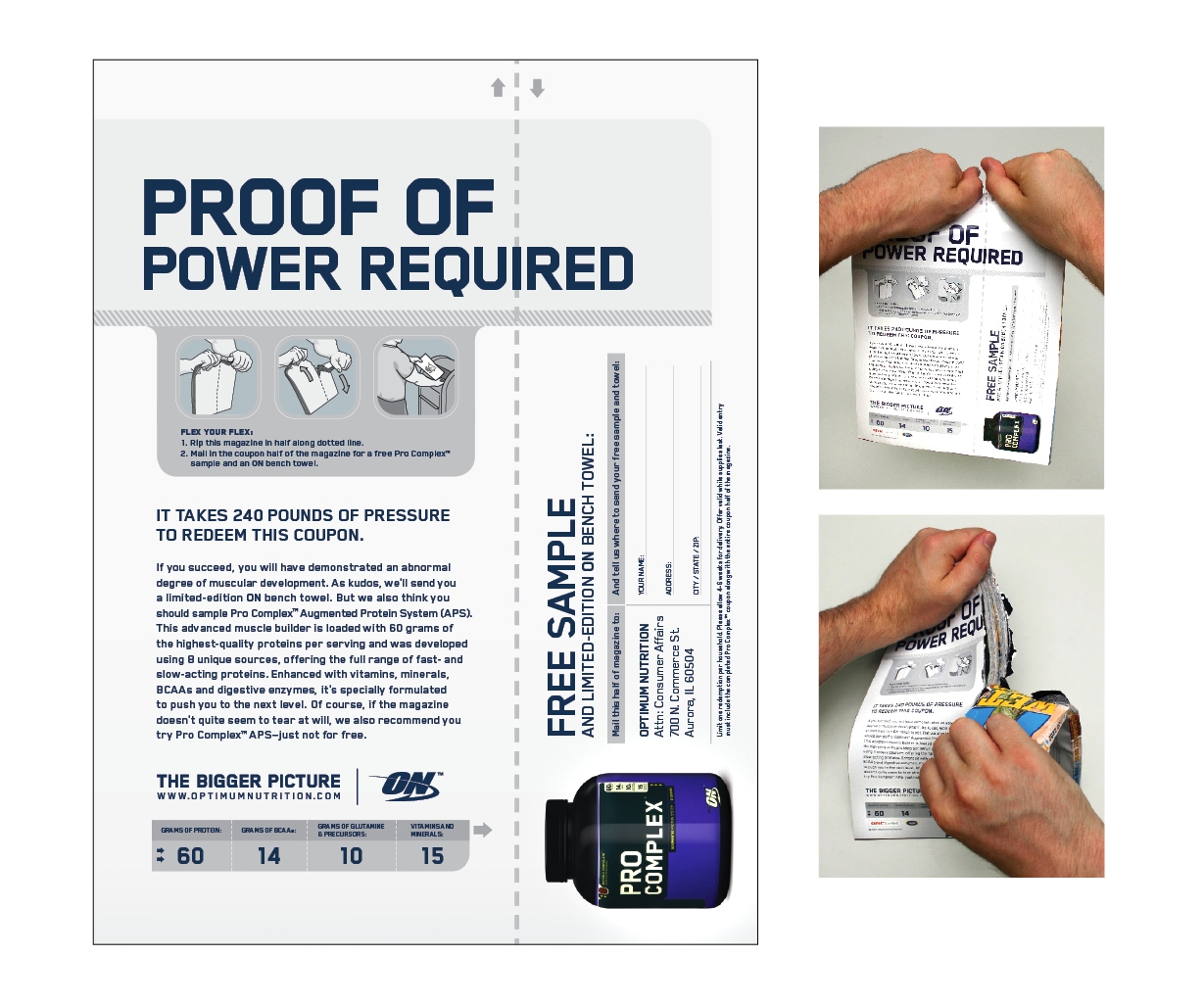
It's a known fact nutritional supplement ads are boring. It's a known fact most coupon-style ads are boring. What's not known is the fact, in advertising, two boring things can, with a twist, become very unboring. That's what Draft/FCB Chicago has accomplished with its campaign for Optimum Nutrition Pro Complex APS. In order to redeem the coupon in this ad for a free sample of the product, the reader must not simply tear out the coupon but tear the entire magazine requiring 240 pounds of force. The ad appeared in the June 2007 issue of Flex.
For those who can't seem to muster the strength required to rip the entire magazine, Optimum Nutrition is happy to send a sample of Pro Complex APS...as long as the requesting party is happy to pay for the sample.
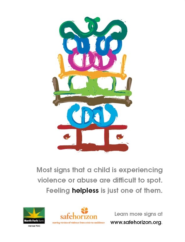
An ongoing campaign from abuse and violence cause group Safe Horizon is illustrating most abuse is hidden from view with ads that hide their messages in a jumble of letters. While the notion of making an ad harder to read could be questioned, the concept, which incorporates the twisted words Disrespected, Abuse, Humiliated, Punched, Kicked, Slapped, and Insulted, aligns nicely with the difficulty of the issue.
The pro-bono campaign, which can be viewed within two PDFs here and here, was created by creative team Rachel Howald and Ahmer Kalam from Howald & Kalam, LLC and will appear in various outdoor media in New York City, daily newspapers and nationally in magazines such as Essence, Redbook and People en Espanol.
- During the Cannes Festival, AdWeek's AdFreak will be publishing LeFreaque, a blog written by jury members and general delegates who will share their experiences with readers.
- Davis Freeberg questions Forbes' and Business Week's acceptance of ads promoting a questionable penny stock.
- Pepsi shareholder launches Pepsi Planet, a site on which can find, or no apparent reason, a gallery of hot/sweet/beautiful/cute women , some posing with a Pepsi can or bottle.
- If you simply can't stand it and absolutely must know the Cannes shortlists - which are far from short - for direct, promotional, media, press, outdoor and radio, they are here.
- Win fame and publicity with Adobe's "Take Creative License" contest which will award publication in the September issue of Graphic Design USA for the designer who creates the best mash up from the Adobe Stock Photos library.
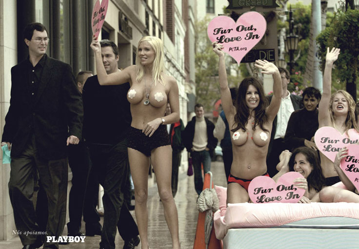
The heart-shaped placards in this Brazilian Playboy ad created by Neogama BBH should really read, "Flesh Out, Saline In." It would do a far better job explaining what's going on in this leftist campaign for the magazine which takes on everything from fur to pollution to bullfighting. See the whole campaign here.
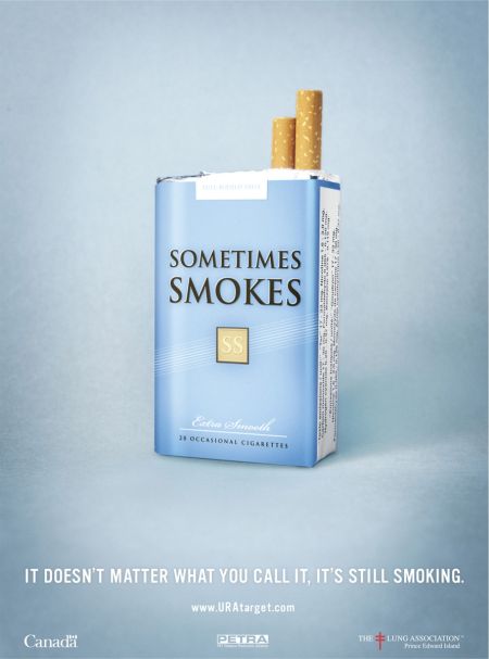
Adpunch blew this print campaign by Extreme Group, Halifax, in our direction. The ads put "social smoking" on blast for the cheap sham that it is.
But excepting the Only When I'm Drinking Cigarettes (which lazy creative came up with that one?), we can't help but think that toting a pack of Sometimes Smokes and Midterm Menthols would draw jaded giggles during just such situations.
It would be just as funny as Shut the Hell Up Gum, which everyone always wants to try despite the implied pwnage.
The print ads invite users to hit uratarget.com, where other tongue-in-cheek fare will again generate wry smiles from the same sometimes-smoking 20-somethings who learned in 5th-grade that smoking can lead to unsightly throat holes and emphysema. But hey, we'll quit when we're 25, so it's all good.
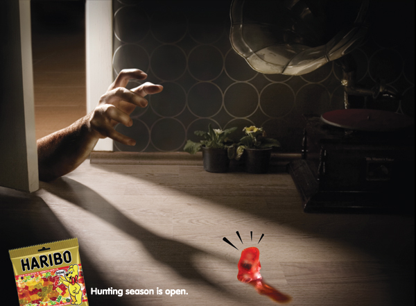
This set of Haribo prints, created by Bedandbreakfast, appeared in all major men's magazines in Turkey when hunting season opened. We weren't sure at first what the red things were, but once we saw the images in the right size we experienced two overwhelming emotions:
1. Understanding
2. Alarm
Those groping hands just reek of malice. The worst part is, we can't decide whether to swear off gummy bears in defense, or buy a pack right now. Because come on, the red ones are best.
And then it hit us: Men's magazines? Really? We would never have guessed.
Check out the third print variant.

|
|


