AllState, best known for its mild-mannered commercials and provocative slogan, "Are you in good hands?" conducts an out-of-character but well-orchestrated PR stunt with the help of Leo Burnett.
In the subsequent ad a man on a mission steals a vehicle and drives it surreally off the top of a Marina City parking garage in Chicago. And just when you're like "OMGWTFBBQ," that soothing meme of a tone takes over: "AllState. Are you in good hands?"
Nervous laughter all around.
This print ad, where a Grand Am teeters precariously over the edge of that same parking structure, follows up on the idea.
AllState, typically favouring the soberest of marketing stances, surprised us with this one. It's a little like God making a joke at our expense. We're sure they got some good buzz out of the deal and maybe even an account or two since people accidentally drive off narrow parking structures all the time.
Doodles are coming back in a big way as suddenly everybody's under the impression they say a lot about you.
To perpetuate this strange idea Lunar BBDO creates a doodle campaign for UK-based Samaritans, which according to the website provides "emotional support for people who are experiencing feelings of distress or despair, including those which may lead to suicide."
Creative director Daryl Corps tells AdCritic, "If you stand close to the poster you'll see the detailed doodles -- but stand back and you'll see that these doodles make up the image of someone who should contact the Samaritans."
Suddenly we want desperately to hide the desk calendar we've been idly doodling on for the last year. Our little pinwheels, inky slashes and bug-eyed monsters make us feel very naked in the face of all this concerned scrutiny. Didn't Patrick Bateman of American Psycho do a lot of doodling too? Look at that. One day you're doodling; the next day you're trying to push a live cat into an ATM machine.
The Sopranos and A&E pair up for Suitcase of Cash, an intelligent though slightly labyrinthine campaign that aims both to court interactivity and get people more involved in their advertising (rather than having them turn in a bunch of manic self-aggrandizing homemade videos).
The game coincides with the January 10 premiere of the show and recalls McD's annual Monopoly contest, though it makes better use of multiple media. Users collect game pieces to arrange on a virtual gameboard.
The game pieces are banner, print and outdoor ads, which can be photographed and uploaded, then mailed to an address that uses military face recognition (kind of like MyHeritage?) to ID the piece in the photo. For online ads, users just need to click, which we're sure will generate higher numbers for everybody's media kits this year.
Our heads are spinning but it sounds like fun and a $100,000 grand prize ain't small pickin's. It would be awesomer still if there was an Assassin twist to it - knocking people off and taking their game pieces would be right up our alley and even better for the Soprano's tie-in.
Women's health and reproductive rights organization IPAS campaigns to get women to speak up when they've been sexually abused. The ads well illustrate both the rage and sense of isolation that occurs when a person's been compromised. The little tear on the right cheek is helpful too, and the font is nice and raw.
The ads were put together by Santaclara, a spankin' new Sao Paulo agency. Well, this is a good strong start. Ethnic variations for IPAS are here and here.
- Cynopsis reports, "The retransmission rights payments disagreement between MediaCom Communications and Sinclair Broadcast Group came to a head late Friday and into Saturday with MediaCom being forced to drop 22 Sinclair stations from its cable system in 12 states as of 12:01a January 6."
- Time Magazine is getting into the blog game with a site makeover, a news aggregator and topical blogs.
- Ecommerce hit the 4100 billion mark in 2006 and continues to charge ahead.
- Brands should know by now an angry mob of bloggers is something to steer clear of lest you want amplified what you intended to be hushed.
- Time says you are the Person of the year. Advertising Age says the consumer is the Agency of the Year. Jonah Bloom explains they really didn't copy Time.
- The free 411 services are catching on with advertisers. Aegon Insurance and Absolut are the latest brands to become advertisers on 1-800-FREE411.
- Heavy.com has closed on a second round of financing, $20 million from Polaris Venture Partners. The financing will be used to expand the network internationally.
Time revamps its tired old site to better serve the interests of 2.0-savvy readers who'd rather sift through snarky blogs than stiff Reuters streams.
The new site vibes like a cross between Yahoo, ZDNet and AdAge, which can be useful if not totally confusing. Critiques about Iraq rub shoulders with Top 10's, quotes du jour and wincing-hip TV-related titles like "Whiteyz with Attitude." Urg. Well, it'll definitely make eye-candy for the scroll-happy.
Time will provide 24/7 news and, in a surprise move that contrasts those of major papers like the New York Times, rendered the entire Time archive of stories, covers and images - from its 1923 debut! - available for free.
Neat. For a brand so big we're sure they'll come up with a way to keep profits from hurting during this most curious process. And we probably won't be the only ones watching closely.
Incognito informer FishnChimps points us in Ariel's direction for a redux in the car wars, which may or may not be a series of spoofs, though one could argue the breadth and popularity of them does these brands a major favor that few legit ads could.
In this iteration of the driving machine battle, BMW calls Jaguar a scaredy-cat by getting nose-to-nose and sending Jag's icon meowing back to the big tree it came from. Very cute even if, as unintentionally demonstrated in this ad, the Jaguar happens to be the prettier car and looks better still when compared to the blunt BMW hood. Nonetheless they got the point across fine.
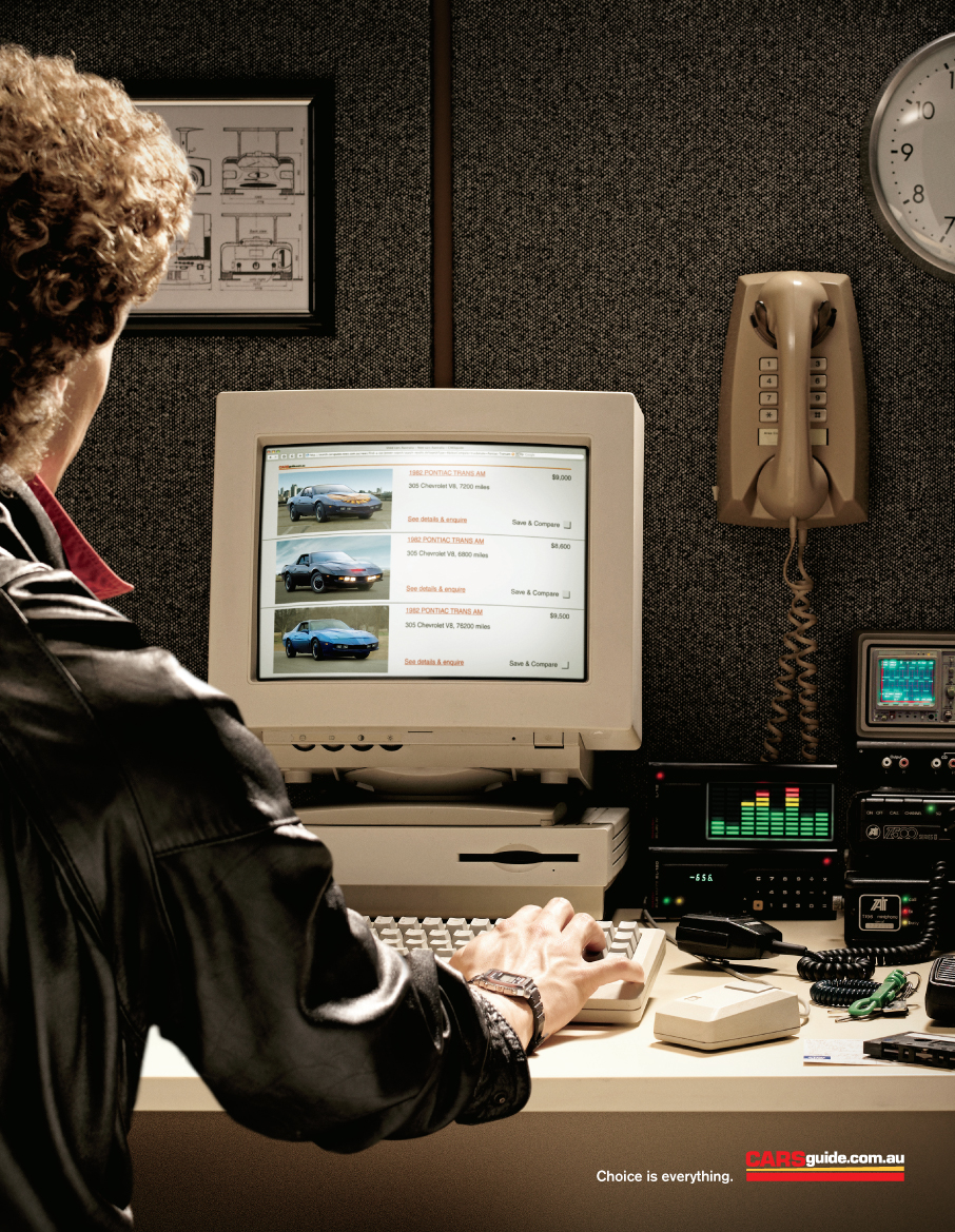
Ad subtlety takes skill and a bit of patience with your consumer, but done well it makes all the difference in a great piece of print or television. A breaking campaign for Cars Guide enlists the magic of Cummins and Partners to deliver the message "Choice is everything."
You need to see the ads big for the full effect but check out the variations with Doc Brown and - by gad - is that Mr. T or a guerilla warrior?! We'd know that telltale feather anywhere. Of course guessing always gets one into trouble so if you know better, let us know and we'll telepathically pin a gold star to your pullover.
Angela's Take: AdAge just named The Consumer as Agency of the Year, hot off the tracks of Time which recently made You its Person of the Year.
What does this mean for you? We guess it means that you're kind of a big deal. Despite the fact you've always had the power, right now you're blowing up like a rock star. With the magic of spending power, ad-critical assertiveness and the frontiers for freedom getting blazed across the internet, publications everywhere are suddenly bowing down in humble supplication.
What does this mean for AdAge? We think they said it all when in the lower right-hand corner of their Consumer article they posted a link to a Scott Donaton piece that reads, "Me-too-itis Hobbles Too Many Marketers' Efforts."
Oopsy.
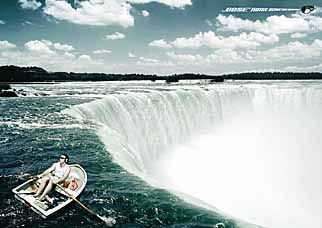
Saatchi and Saatchi throw together this print illustration of a rower fit to slip into a formidable Scylla-and-Charybdis-like vacuum because his Bose noise cancellation headphones are so awesome he just can't pay attention.
Funny how you get punished for not paying attention in real life, but this same deficit comes as a premium when illustrating how distractingly awesome a given product happens to be. Does that really help sell shit? We love the idea of getting lost with Beethoven but if the composer himself can actually fly down from heaven and lift us out of a boat destined for disaster then all the better, you can sign us up for some Bose headphones right now.
We somehow doubt the sound quality is that great, though.

|